
How to Read a Stock Chart: The Complete Beginner’s Guide
Last updated: January 2026
You open your brokerage app.
You see a stock you’re interested in. There’s a colorful chart with lines going up and down, candlesticks in green and red, mysterious abbreviations like EMA, RSI, MACD, and volume bars.
You have no idea what any of it means.
So you close the app and move on.
This is the moment most beginners miss the opportunity to invest confidently.
They see a stock chart and feel overwhelmed. “This is too complicated. I’ll just buy what everyone else buys.”
But here’s the truth: Reading a stock chart is simpler than you think.
You don’t need to understand every indicator. You don’t need to be a technical analyst. You just need to understand the basics—what the price is doing, whether it’s trending up or down, where support and resistance are, and what volume tells you.
That’s it.
In this guide, you’ll learn exactly what a stock chart is and why they exist, the core elements every chart has (price, time, volume), how to read candlestick charts (the most common format), what trends mean and how to identify them, key technical levels (support and resistance), the most useful indicators for beginners, common chart patterns and what they signal, and how to use charts to make better investment decisions.
By the end, you’ll confidently read any stock chart and understand what the price is telling you.
Let’s decode the chart.
What is a Stock Chart? (And Why They Matter)
A stock chart is a visual representation of a stock’s price movement over time.
It shows you how a stock’s price has changed, when it changed, and how much buying/selling activity happened.
Why Charts Matter
Charts answer critical questions:
- Is this stock going up or down?
- Is it at a good price to buy?
- Where might it find support?
- Is there strong buying or selling pressure?
- Is this trend likely to continue?
You can answer these questions just by looking at the price history.
Types of Charts
Line Charts (Simplest):
- Just a line connecting closing prices
- Shows overall trend
- Missing detail about daily movement
- Good for beginners getting started
Bar Charts (More Detail):
- Shows open, high, low, close for each day
- Vertical bars indicate price range
- More information than line charts
- Still missing some detail
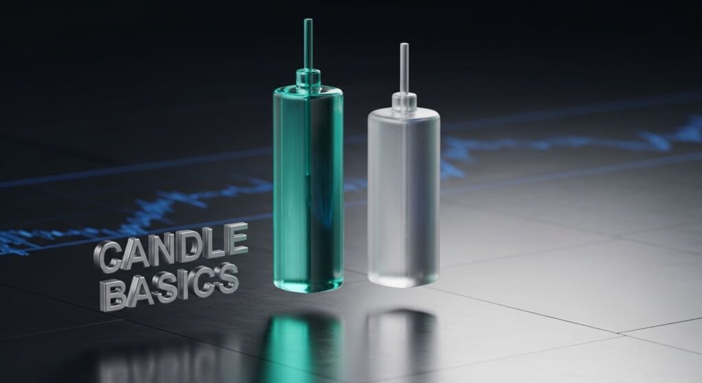
Candlestick Charts (Most Popular):
- Shows open, high, low, close visually
- Green candle = price went up (bullish)
- Red candle = price went down (bearish)
- Most traders use these
- Best for serious chart reading
Core Chart Elements: Price, Time, and Volume
Every stock chart has three essential components.
Element 1: Price (Y-Axis)
What it shows: Stock price on the vertical axis
Example:
- Bottom = $100
- Top = $150
- Stock trading anywhere between
Price tells you:
- Is stock expensive or cheap right now?
- Has price been rising or falling?
- How far has it moved?
Element 2: Time (X-Axis)
What it shows: Time period on the horizontal axis
Common timeframes:
- 1-minute chart: Shows last 1 minute (for day traders only)
- 5-minute chart: Shows last 5 minutes (day traders)
- 1-hour chart: Shows last 1 hour (active traders)
- Daily chart: Shows one day per candle (most common)
- Weekly chart: Shows one week per candle (long-term investors)
- Monthly chart: Shows one month per candle (very long-term)
Beginner recommendation: Use daily or weekly charts. Ignore 1-minute, 5-minute, hourly (too much noise).
Element 3: Volume (Bottom Panel)
What it shows: How many shares traded in each period
Displayed as bars below the price chart:
- Tall bar = high volume (lots of trading)
- Short bar = low volume (few shares traded)
- Volume matters for confirming trends
Understanding Candlesticks (Candles Explained)
Candlesticks are the standard format. Master these and you’ve got it. Major brokerages and financial platforms provide free charting tools with real-time data. The SEC offers educational resources on how to use charts effectively.
Candlestick Anatomy
Each candle shows 4 prices:
Open: Price at beginning of period (where trading started)
Close: Price at end of period (where trading ended)
High: Highest price during period (peak)
Low: Lowest price during period (bottom)
Bullish Candle (Green = Price Went Up)
Visual:
- Green rectangular body
- Small wick above (high)
- Small wick below (low)
What it means:
- Price opened lower, closed higher
- Buyers pushed price up
- Bullish momentum
Example:
- Opened at: $100
- Closed at: $105
- High: $106
- Low: $99
- Green candle shows buying pressure
Bearish Candle (Red = Price Went Down)
Visual:
- Red rectangular body
- Small wick above (high)
- Small wick below (low)
What it means:
- Price opened higher, closed lower
- Sellers pushed price down
- Bearish momentum
Example:
- Opened at: $105
- Closed at: $100
- High: $107
- Low: $98
- Red candle shows selling pressure
The Wicks (Shadows)
Wicks are the thin lines above and below the candle body.
Upper wick (rejection):
- Shows price went higher but came back down
- Indicates buyers couldn’t hold gains
- Rejection of higher prices
Lower wick (bounce):
- Shows price went lower but came back up
- Indicates sellers couldn’t push lower
- Support found at that level
Long wicks = more indecision Short wicks = strong conviction
Reading Trends: Up, Down, and Sideways

The most important chart skill: Identifying the trend
Uptrend (Bullish)
What it looks like:
- Candles generally going up
- Higher highs
- Higher lows
- Each bounce higher than previous bounce
What it means:
- Buyers in control
- Stock momentum positive
- More likely to continue up
- Good time to buy (on dips)
Example: Stock goes $100 → $102 → $101 → $103 → $104 (higher highs/lows = uptrend)
Downtrend (Bearish)
What it looks like:
- Candles generally going down
- Lower highs
- Lower lows
- Each rally lower than previous rally
What it means:
- Sellers in control
- Stock momentum negative
- More likely to continue down
- Not good time to buy
Example: Stock goes $100 → $98 → $99 → $97 → $96 (lower highs/lows = downtrend)
Sideways Trend (Range-Bound)
What it looks like:
- Candles bouncing up and down
- No clear direction
- Bouncing between two prices
- Stuck in a range
What it means:
- Neither buyers nor sellers in control
- Indecision in market
- Could break either direction
- Wait for breakout
Example: Stock bounces $100 → $105 → $100 → $105 → $100 (stuck in range)
Trend Line Identification
Simple method:
- Connect the lows in uptrend with a line
- Connect the highs in downtrend with a line
- Trend line shows direction
If price breaks trend line:
- Trend reversal possible
- Important signal
Support and Resistance: Key Price Levels
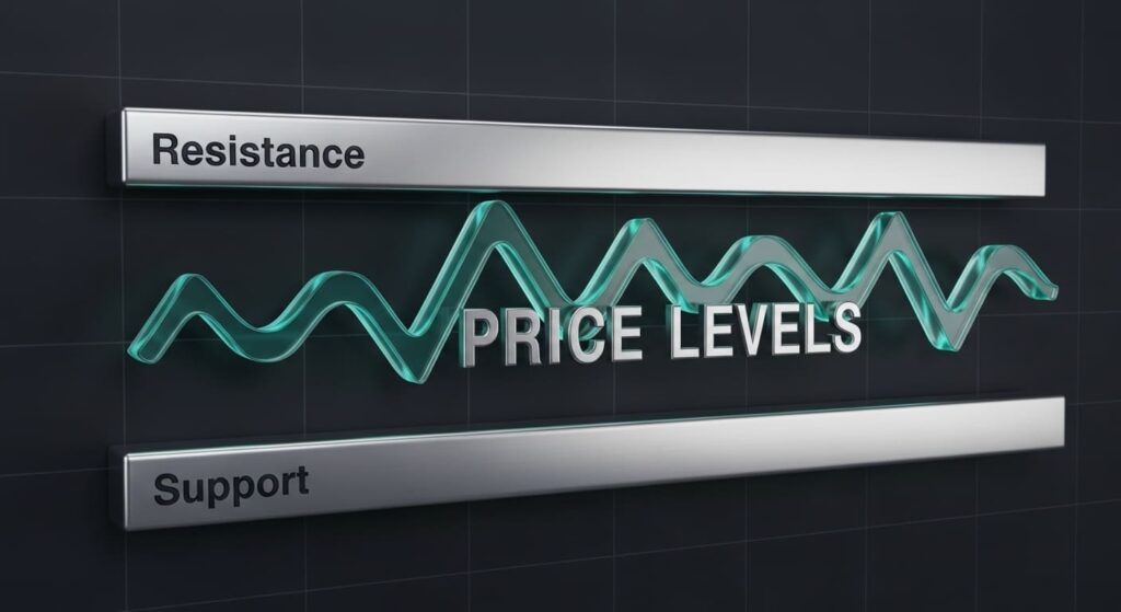
One of the most useful concepts for chart reading
Support (Floor)
What it is: Price level where stock tends to bounce up
How it forms:
- Buyers keep buying at certain price
- Stock drops to that price, then bounces up
- Happens multiple times
- Creates “support level”
Why it matters:
- Good buying opportunity (stock bounced here before)
- If breaks below, trend reversal warning
Example: Stock drops to $100 three times and bounces up each time. $100 is support.
Resistance (Ceiling)
What it is: Price level where stock tends to get pushed down
How it forms:
- Sellers keep selling at certain price
- Stock rallies to that price, then falls back
- Happens multiple times
- Creates “resistance level”
Why it matters:
- Stock struggles here (got rejected before)
- If breaks above, trend reversal signal
Example: Stock rallies to $110 three times and falls back each time. $110 is resistance.
Support/Resistance Switch
Critical concept: When support is broken, it becomes resistance (and vice versa)
Example:
- Stock bouncing at $100 support for months
- Finally breaks below $100
- Now tries to rally back to $100
- But $100 becomes resistance (rejected by sellers)
- Stock can’t get back above it
Moving Averages: Identifying Trend Direction
Moving averages smooth out price noise and show trend.
What is a Moving Average?
Simple calculation: Average of closing prices over X days
Example (20-day MA):
- Add last 20 days of closing prices
- Divide by 20
- Get average
- Plot it on chart
- Update daily
Using Moving Averages
20-day Moving Average (Short-term Trend):
- Shows trend over last month
- Useful for quick changes
- Closer to actual price
- More sensitive to changes
50-day Moving Average (Medium-term Trend):
- Shows trend over last ~2.5 months
- Useful for medium-term direction
- Smoother than 20-day
- Less noise
200-day Moving Average (Long-term Trend):
- Shows trend over last ~9 months
- Useful for major trend direction
- Very smooth
- Often acts as support/resistance
Many trading platforms like TradingView offer advanced charting tools with dozens of indicators and pattern recognition features for technical analysis.
How to Use Them
Price above MA: Uptrend (usually)
Price below MA: Downtrend (usually)
MA pointing up: Trend strengthening up
MA pointing down: Trend strengthening down
Price crosses MA: Possible trend change
Volume: Understanding Buying and Selling Power
Volume shows conviction behind price moves.
What Volume Tells You
High volume on up day:
- Many shares traded while price going up
- Strong buying conviction
- Uptrend likely to continue
High volume on down day:
- Many shares traded while price going down
- Strong selling conviction
- Downtrend likely to continue
Low volume on up day:
- Few shares traded while price going up
- Weak buying
- Rally might not stick
Low volume on down day:
- Few shares traded while price going down
- Weak selling
- Decline might not stick
Volume Confirmation
Use volume to confirm trends:
Uptrend with rising volume: ✅ Healthy (buying strengthens)
Uptrend with falling volume: ⚠️ Warning (buying weakening)
Downtrend with rising volume: ⚠️ Serious (selling strong)
Downtrend with falling volume: ✅ Weakening (selling losing power)
The Most Useful Indicators for Beginners
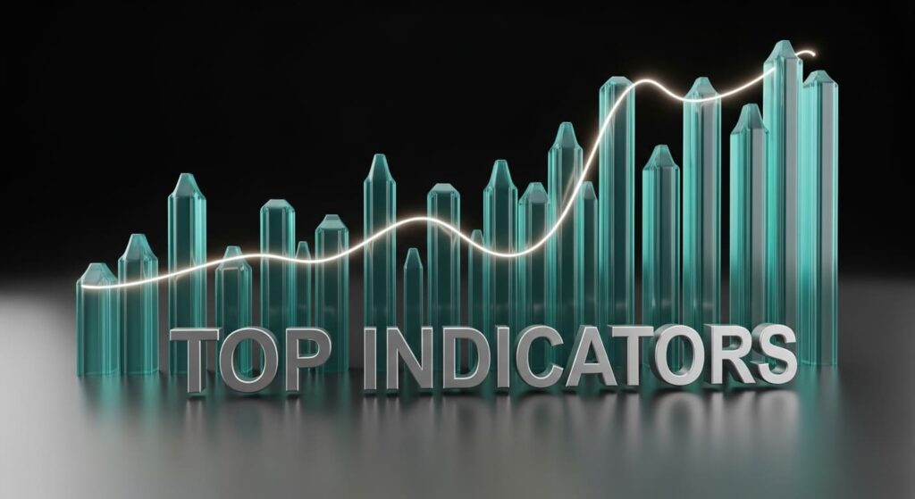
You don’t need dozens of indicators. These few work well
Indicator 1: Moving Averages
Already covered above. This is essential.
Use: 20, 50, 200-day MAs For: Identifying trend direction Beginner-friendly: YES
Indicator 2: RSI (Relative Strength Index)
What it is: Measures if stock is “overbought” or “oversold”
How it works:
- Scale 0-100
- Above 70 = overbought (stock extended up, might pullback)
- Below 30 = oversold (stock extended down, might bounce)
- 30-70 = neutral zone
Use: Confirm when to buy/sell Beginner-friendly: YES
Indicator 3: MACD (Moving Average Convergence Divergence)
What it is: Shows momentum and trend changes
How it works:
- Two lines (MACD and Signal)
- When MACD crosses above Signal = bullish
- When MACD crosses below Signal = bearish
Use: Confirm trend changes Beginner-friendly: MODERATE (little complex but useful)
Indicators to AVOID as Beginner
❌ Bollinger Bands (too many false signals)
❌ Stochastic (confusing for beginners)
❌ Fibonacci Retracements (too advanced)
❌ Multiple indicators at once (analysis paralysis)
Focus on: Price, trend, volume, moving averages. That’s 80% of what you need.
Common Chart Patterns and What They Signal
Chart patterns repeat and signal possible moves.
Pattern 1: Head and Shoulders (Reversal)
What it looks like: Three peaks (small-big-small), like a head with shoulders
What it signals:
- Reversal of uptrend
- Price likely to fall after pattern completes
- Bearish signal
How to use:
- When formed after uptrend, prepare for reversal
- Short signal (for advanced traders)
- Exit position for long-term holders
Pattern 2: Cup and Handle (Continuation)
What it looks like: U-shaped cup with small handle on right side
What it signals:
- Continuation of uptrend
- After pullback, price likely to continue up
- Bullish signal
How to use:
- When formed, expect trend to continue
- Good entry point near handle
- Buy signal
Pattern 3: Double Top (Reversal)
What it looks like: Two peaks at same level (M-shaped)
What it signals:
- Stock tried twice to break resistance
- Failed both times
- Likely to reverse down
- Bearish signal
Pattern 4: Double Bottom (Reversal)
What it looks like: Two valleys at same level (W-shaped)
What it signals:
- Stock tried twice to break support
- Bounced both times
- Likely to reverse up
- Bullish signal
Pattern 5: Ascending Triangle (Continuation/Breakout)
What it looks like: Flat top resistance, rising bottom support
What it signals:
- Accumulation (smart money buying)
- Likely breakout above resistance
- Bullish signal
How to Use Charts Without Getting Overwhelmed
The most important section.
Step 1: Choose One Timeframe
Decision: Daily or weekly charts?
For most beginners: Daily charts
- Shows trend clearly
- Not too much noise
- Not missing quick changes
- Perfect starting point
Set on your brokerage app and stick with it.
Step 2: Identify the Trend
Ask yourself:
- Is price above or below 200-day moving average?
- Are there higher highs and higher lows? (Uptrend)
- Are there lower highs and lower lows? (Downtrend)
- Is price stuck sideways? (Range-bound)
That’s it. You now know the trend.
Step 3: Find Support and Resistance
Look at the chart:
- Where has price bounced up multiple times? (Support)
- Where has price gotten rejected multiple times? (Resistance)
- Draw horizontal lines at these levels
Simple but powerful.
Step 4: Check Volume
Does the current move have volume backing it?
- High volume on trend continuation? ✅ Healthy
- Low volume on move? ⚠️ Weak
- Volume tells you conviction
Step 5: Make Decision
Based on all above, ask:
- Is stock in uptrend? Consider buying
- Is stock in downtrend? Avoid buying
- Is stock at support in uptrend? Good entry
- Is stock at resistance? Wait for breakout
You don’t need complex analysis. Trend + support/resistance + volume = 80% of what matters.
Frequently Asked Questions — FAQ 👈
Q: Do I need to understand every indicator?
A: No. Most indicators say the same thing. Master price, trend, support/resistance, volume. Skip the rest.
Q: Which timeframe is best?
A: For long-term investing, daily or weekly. For day trading, hourly or lower. Avoid 1-minute charts if learning.
Q: Can I predict the future with charts?
A: No. Charts show probability, not certainty. Stock can break any pattern. Use charts for guidance, not guarantee.
Q: What if I buy right before a crash?
A: Charts don’t prevent crashes. They just show probability. Even perfect chart reading can’t predict black swan events.
Q: Should I use automated alerts?
A: Yes. Many brokerages offer alerts when price hits support/resistance or breaks moving averages. Automation helps.
Q: Are charts more useful for stocks or crypto?
A: Crypto is more volatile, so patterns are clearer but less reliable. Stocks better for chart analysis. Both work.
Q: How long to learn chart reading?
A: Basics (trend, support, resistance, volume): 1-2 weeks. Mastery: 6-12 months of practice.
🎥 BONUS
Want to see live examples of reading charts and identifying trends?
This video shows real stock charts and explains what each element means:
FINAL THOUGHTS: Charts Are Your Conversation with the Market
Here’s what most beginners don’t realize: Stock charts are the market’s way of talking to you.
Every candle is a conversation between buyers and sellers. Every trend tells a story.
Every support and resistance level shows where the market has paused.
When you learn to read charts, you’re learning to listen to what the market is actually saying, not what news headlines are screaming.
The power isn’t in predicting the future. It’s in understanding the present.
Is the stock in a uptrend? Yes? Then buying on dips makes sense. Is it breaking support? Yes?
Then caution is warranted. Is volume weak? Yes? Then the move might not stick.
These aren’t predictions. They’re probabilities based on what actually happened before.
You don’t need to be a technical analyst. You don’t need to understand every indicator.
You just need to understand:
- The trend direction
- Key support and resistance levels
- Volume confirmation
- That’s it
Master those three things and you’re ahead of 90% of investors.
Your next step: Open a chart right now. Look at a stock you’re interested in.
Identify the trend. Find support and resistance. Check the volume.
You just read a stock chart.
It’s that simple.
INTERESTING TOPICS
Ready to understand how market volatility affects the patterns you see on charts?
Want to discover how to choose your first investment using chart analysis to time your purchase?
Need to learn how to diversify based on different chart patterns across sectors?
Want more financial insights delivered to you? Subscribe to our newsletter
and get weekly articles with practical strategies to grow your wealth sent straight to your inbox.
Obs: Sign up for our newsletter and receive a free Finance For Beginner eBook.
Disclaimer: This article is for educational purposes only. Diversification does not guarantee profits or protect against all losses. Consider your financial situation, risk tolerance, and investment timeline before making investment decisions.
—— End of Article ——